
In order to test some ideas for the Beaver log analysis tool, some proofs-of-concept were made to see what was possible using python and how easy it would be to try to integrate a Qt gui with matplotlib charting functions. This page describes some of these prototypes.
These prototypes were built using python, using Qt for the gui. There was also some visualisation prototyping done using matplotlib. Some of these visualisations are shown in screenshots below.
There are two basic steps to the tool. The first is to read a directory full of log files in txt or .gz format, extract the relevant information and put them together into a single text file. That's the first step of the process and only needs to be done once. As well as consolidating the files into one single one, it ignores uninteresting requests like css files and gifs, reducing the amount of data. It also doesn't preserve the IP address or the user agent string, although it does use the user agent to distinguish between people and robots (partly based on whether that agent accesses the "/robots.txt" url). Other tasks it does include cleaning up the url and resolving duplicates, separating out the referrer site from the referrer url, and extracting the search query (if any).

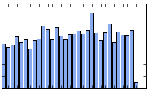
First column chart for daily hits

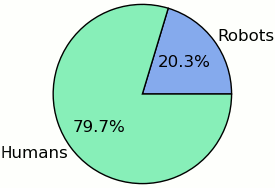
First pie chart of agent type

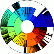
First url breakdown using matplotlib
The second step reads this text file, and summarizes the information about dates, status codes, urls, referrers and search queries. The filtering part performs exact matching, fuzzy matching, and exclusion filters (eg, show all sites except that one). So you can already do a lot of the searching functions and the output goes to Qt classes for display in a (very) simple gui.
The major success was getting matplotlib working, firstly making a nice hierarchical usage chart (a bit similar to the ones produced by filelight and baobab), as shown on the right. These plots can also be saved as svg or png file, so the graphics can be edited and reformatted with either vector tools (like Inkscape) or raster tools (like Gimp).
Also to the right is an example of a pie chart, again produced by matplotlib, this time looking at whether the agent looks like a human or a robot. Obviously all the filters also work for this feature, so you can see the breakdown for a particular page, or group of pages. And finally, a simple column chart showing hits per day, again taking all the filters into account.